

Mallorca
_
We have already collaborated with Mallorca on several occasions.
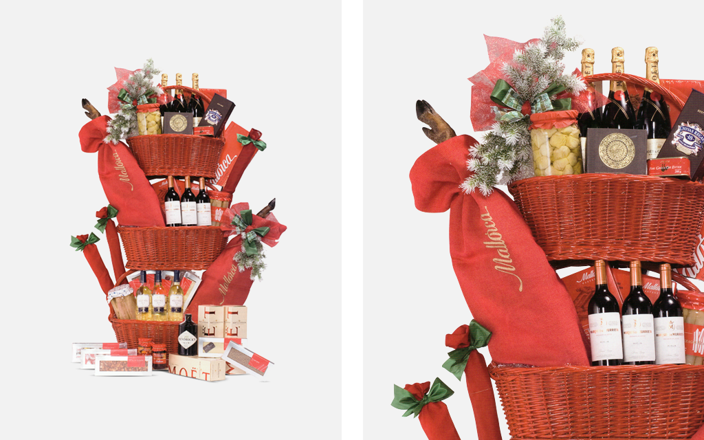
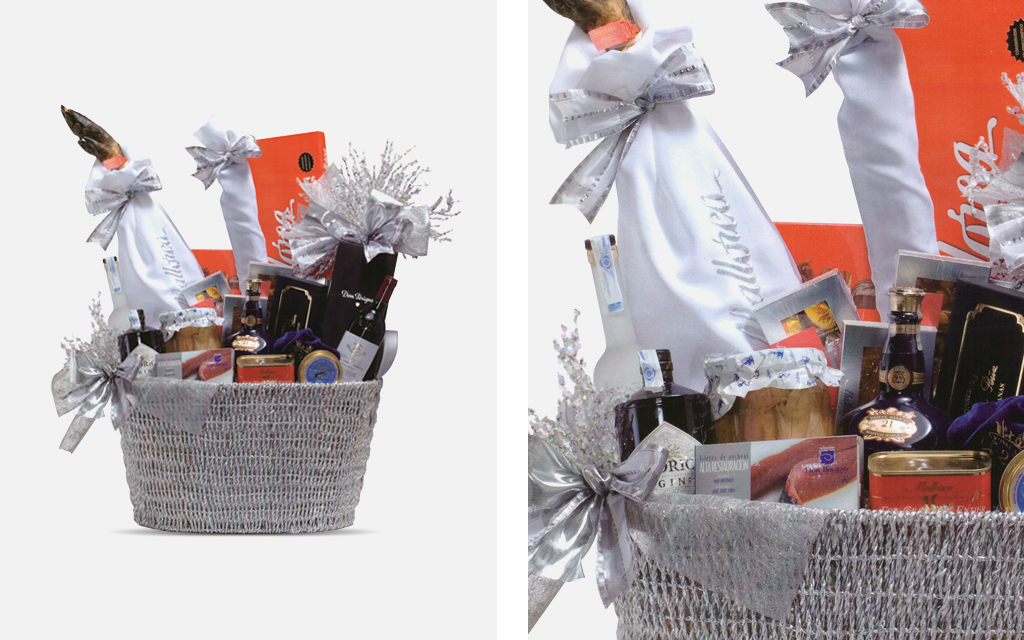
Once they assigned us the design and manufacture of some sheaths to present their Iberian products in their Christmas baskets: hams and loins. Designed with a resistant fabric in two colors: some in red and embroidered in golden thread and others in white embroidered in silver thread. The interior of the sheaths was laminated to preserve the product’s quality and also to keep its appearance intact at all times.
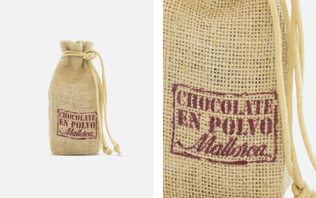
They also assigned us the design and manufacture of an item to present their chocolate powder, one of their most traditional products. We created a small jute pouch to express the idea of tradition. The printing of the name “Mallorca” and “Chocolate Powder” was made imitating an old stamp in a chocolate brown color. The pouch closed by shirring two strings.
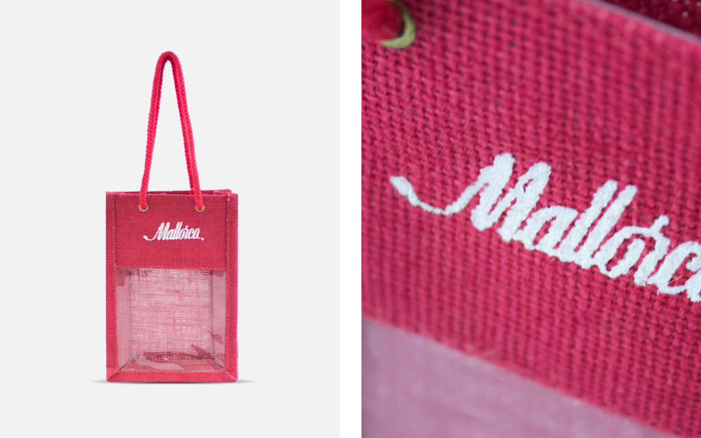
Mallorca thought of Cover once again to elaborate a new packaging element. This time, it was a small bag to present their assortment of products. We used the same material again: jute. This time, we made a small bag with handles and a PVC window so the products could be seen by customers. The bag was red and the printing was made in white ink.
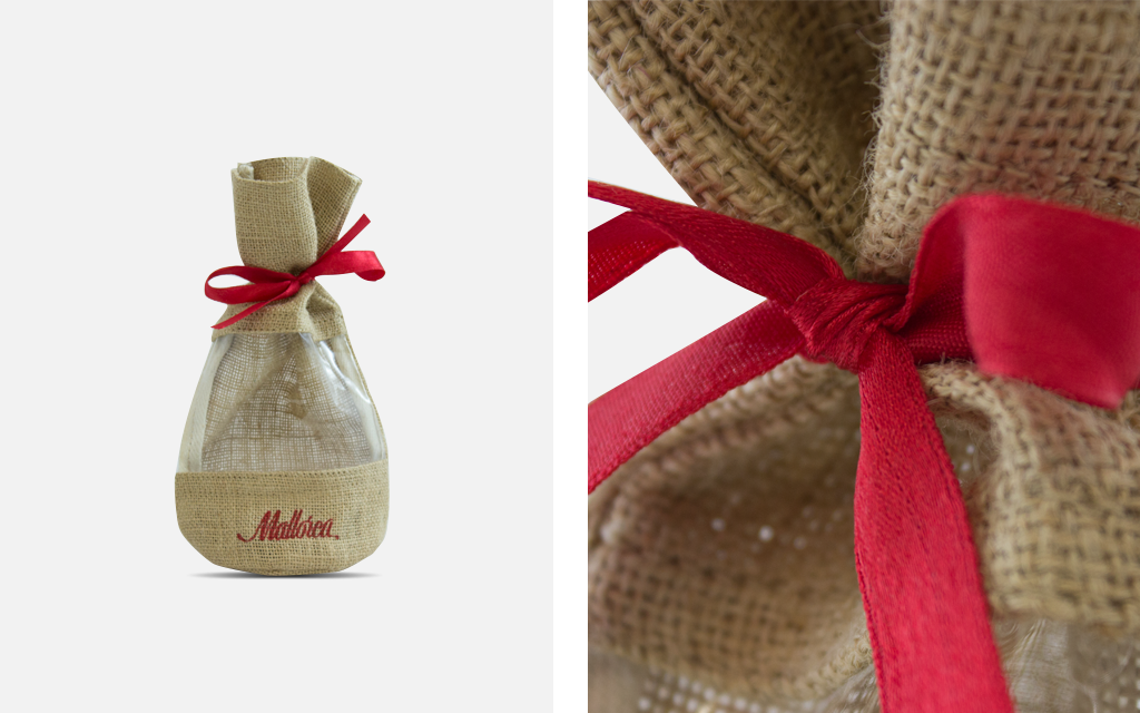
Another assignment we got from Mallorca was, again, a jute packaging element. It is a classic material that transmits simplicity, tradition and quality. We designed a small pouch with a closing satin ribbon and a PVC window to show the products it held. Both the ribbon to close the small pouch and the printed bakery’s name, were made in the corporate color: red.
.
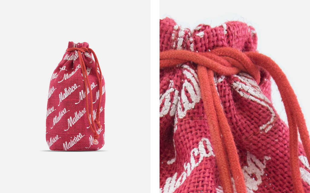
After the success of the packaging elements we had previously made, Mallorca also chose us for the Christmas season. The project was creating a packaging for their collection of Christmas products. This time, we again designed a small, red jute pouch with the name “Mallorca” printed in white ink all around the pouch.
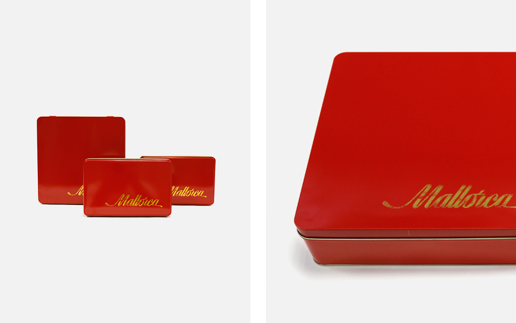
For the presentation of their chocolates, we carried out the design and manufacture of some metallic boxes. They had the corporate color but, this time, we decided to use a gold color for the logo. Gold is the color of luxury, a feeling of happiness. Those objects that cannot be made of gold, are gold plated and automatically become luxury items. This is the feeling we want to transmit. The interior of the boxes was also barnished in gold color.