ROXON
23 May, 2025
ROXON
_
Diseño de catálogo de productos para la implantación de la marca en el mercado español.

Diseño de catálogo de productos para la implantación de la marca en el mercado español.
Diseño del catálogo de productos para Pasabache, con un enfoque visual y editorial, poniendo en valor la identidad de la marca y la calidad de sus productos.
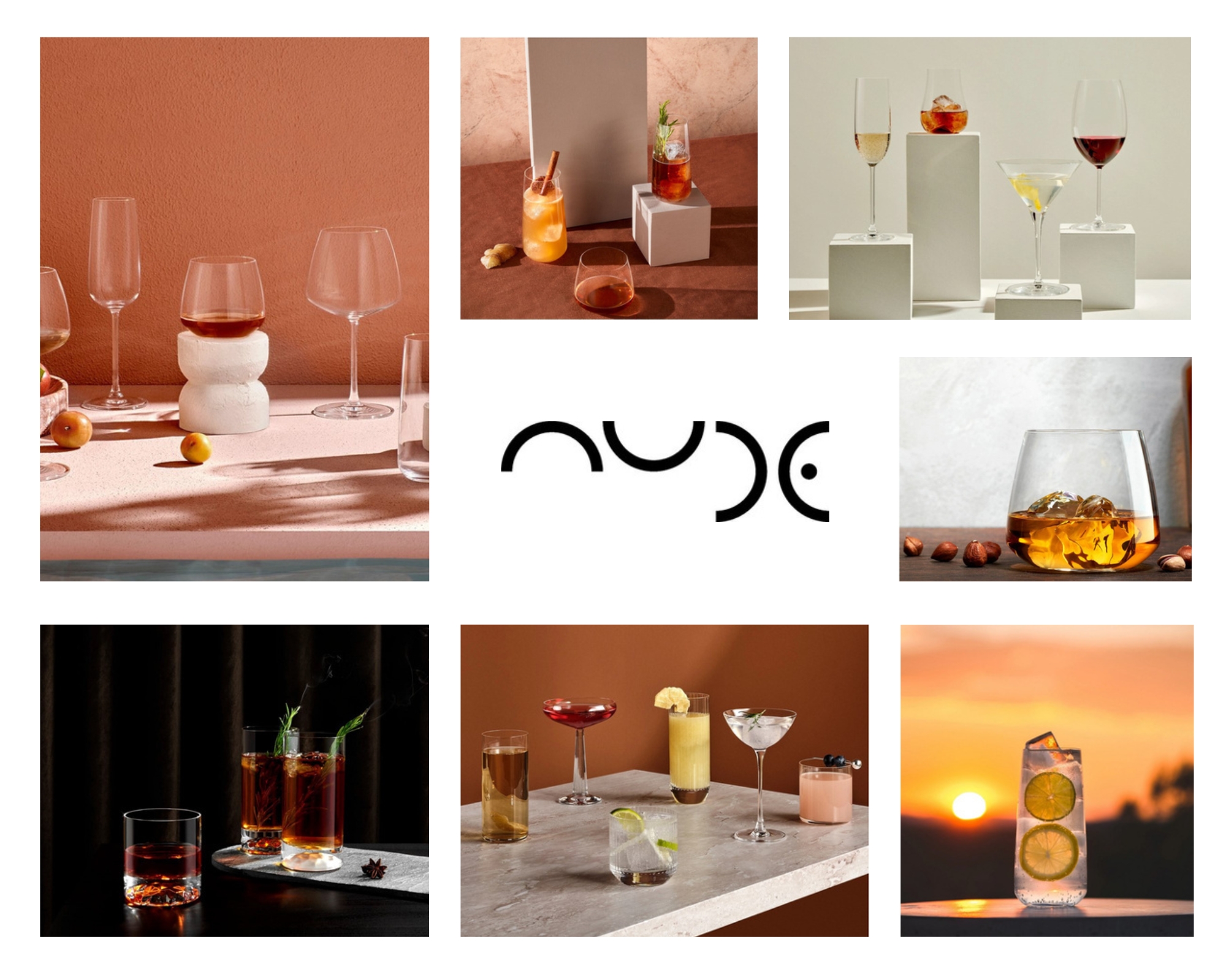
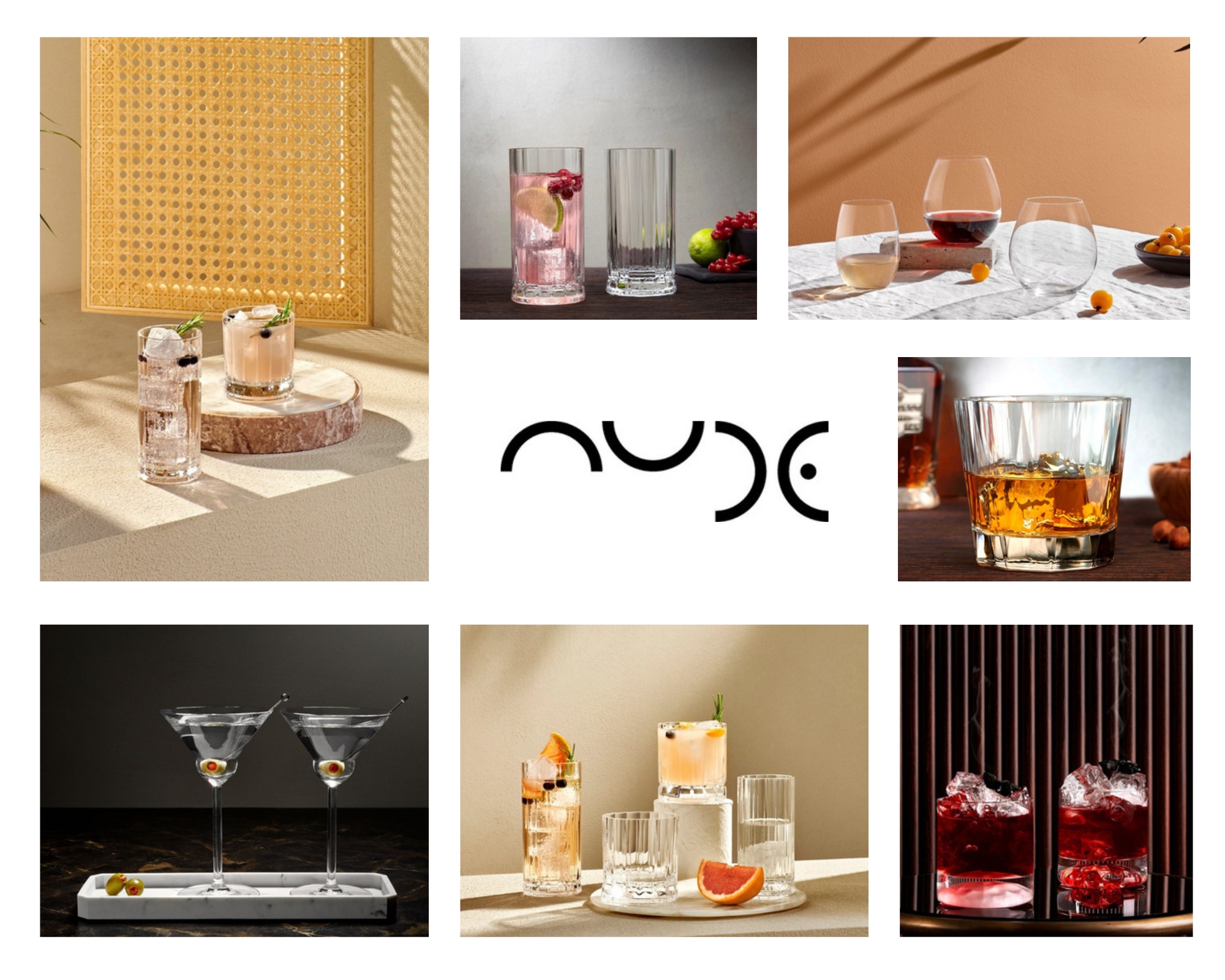
Diseño de presentación de cristalería para la marca Nude.
Una propuesta visual que resalta la calidad, elegancia y sofisticación que caracteriza a la firma.

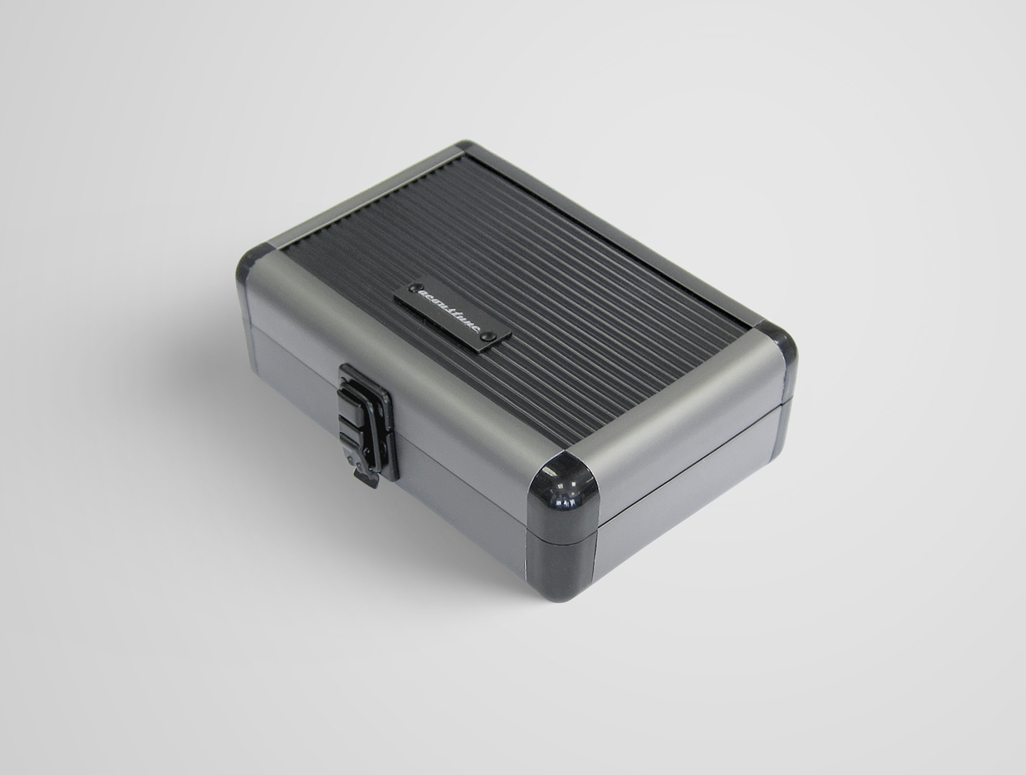
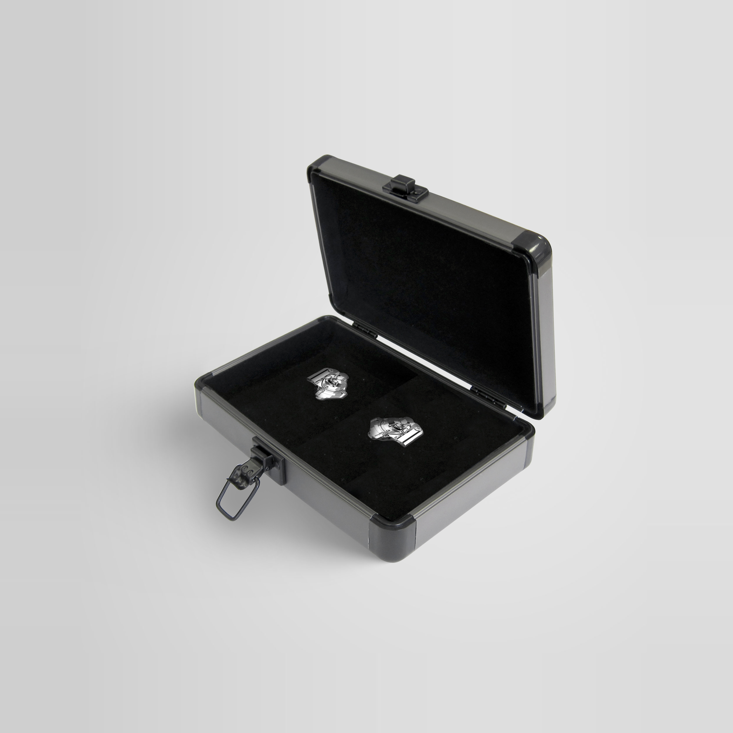
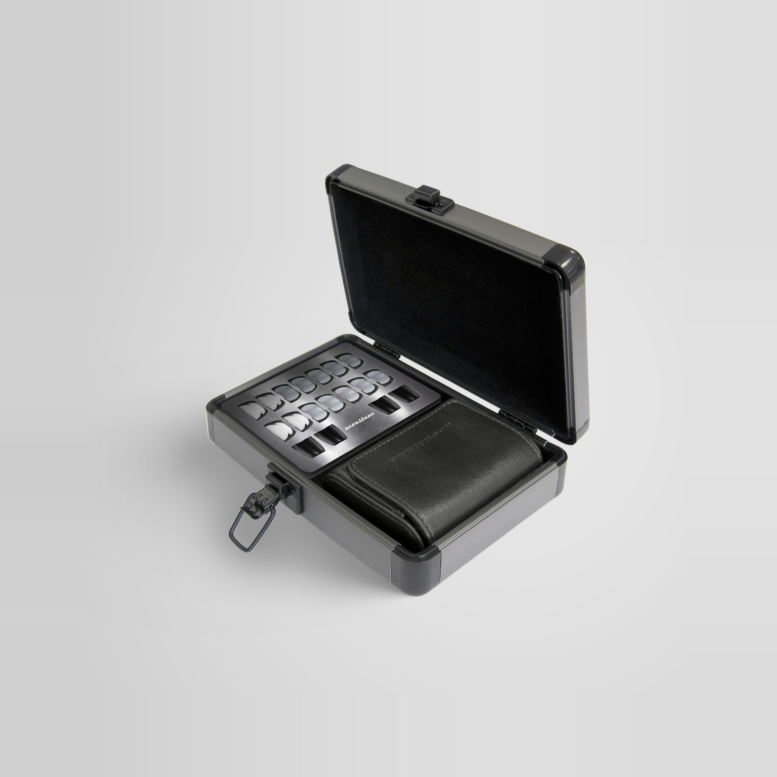
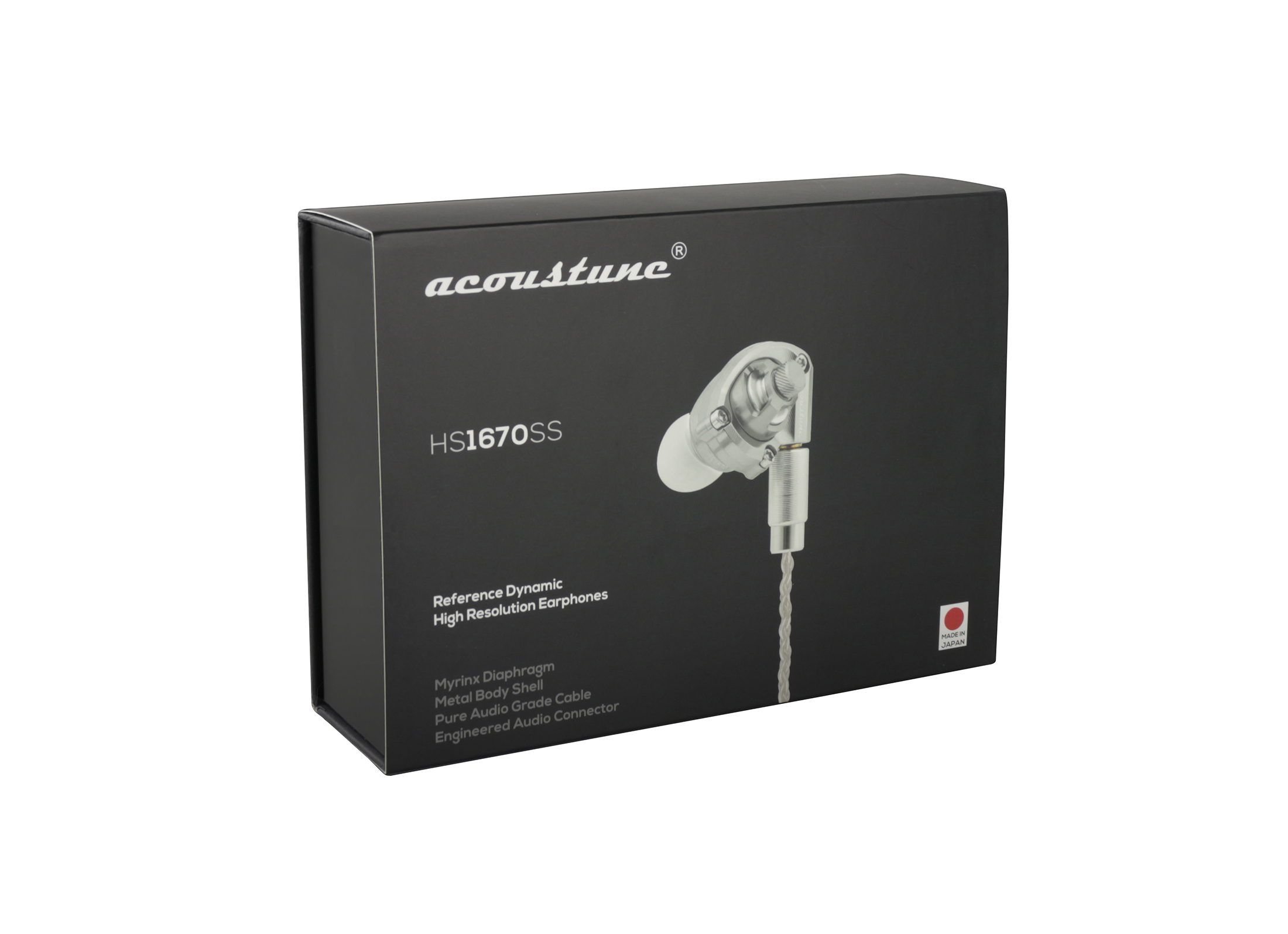
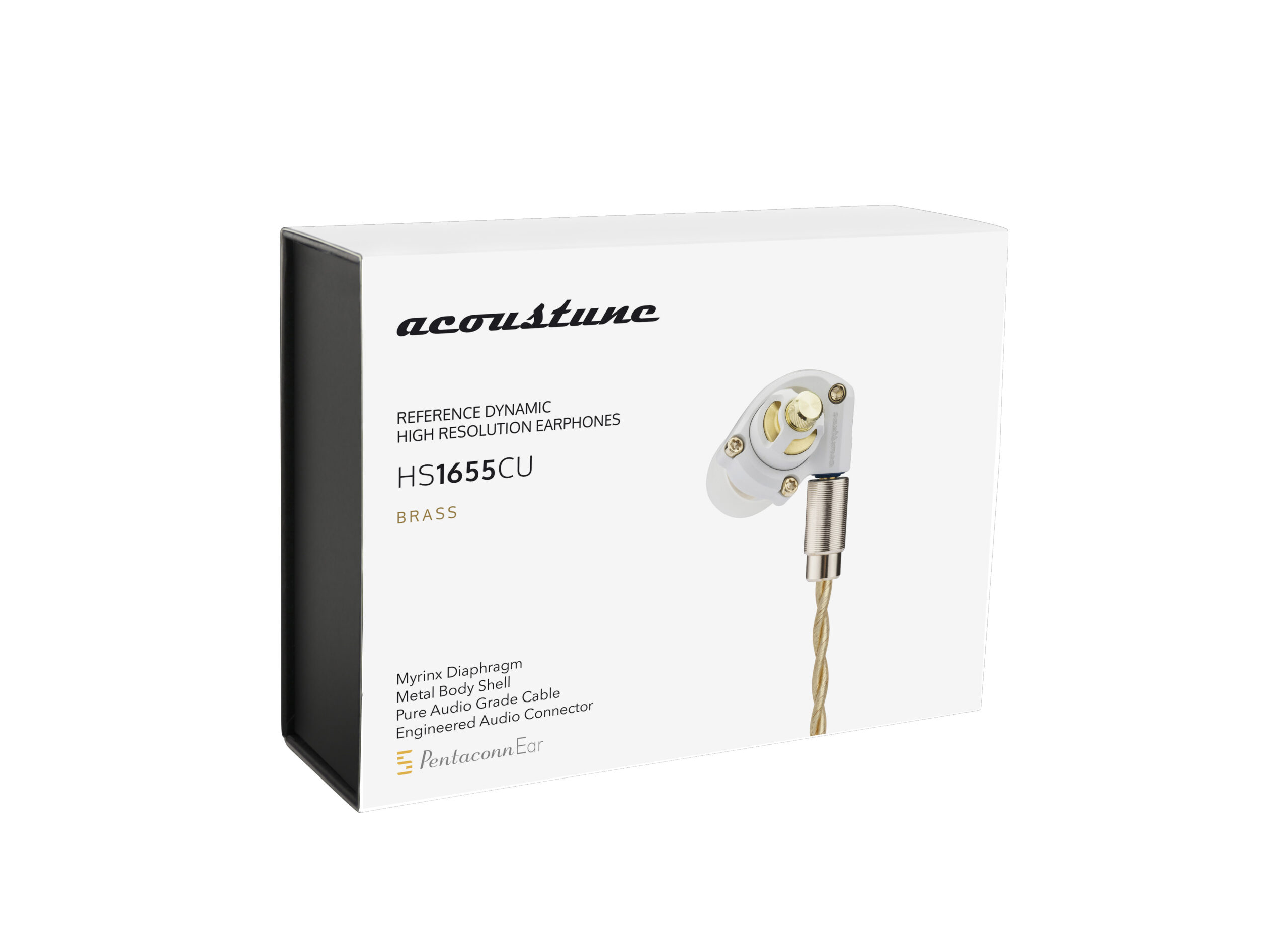
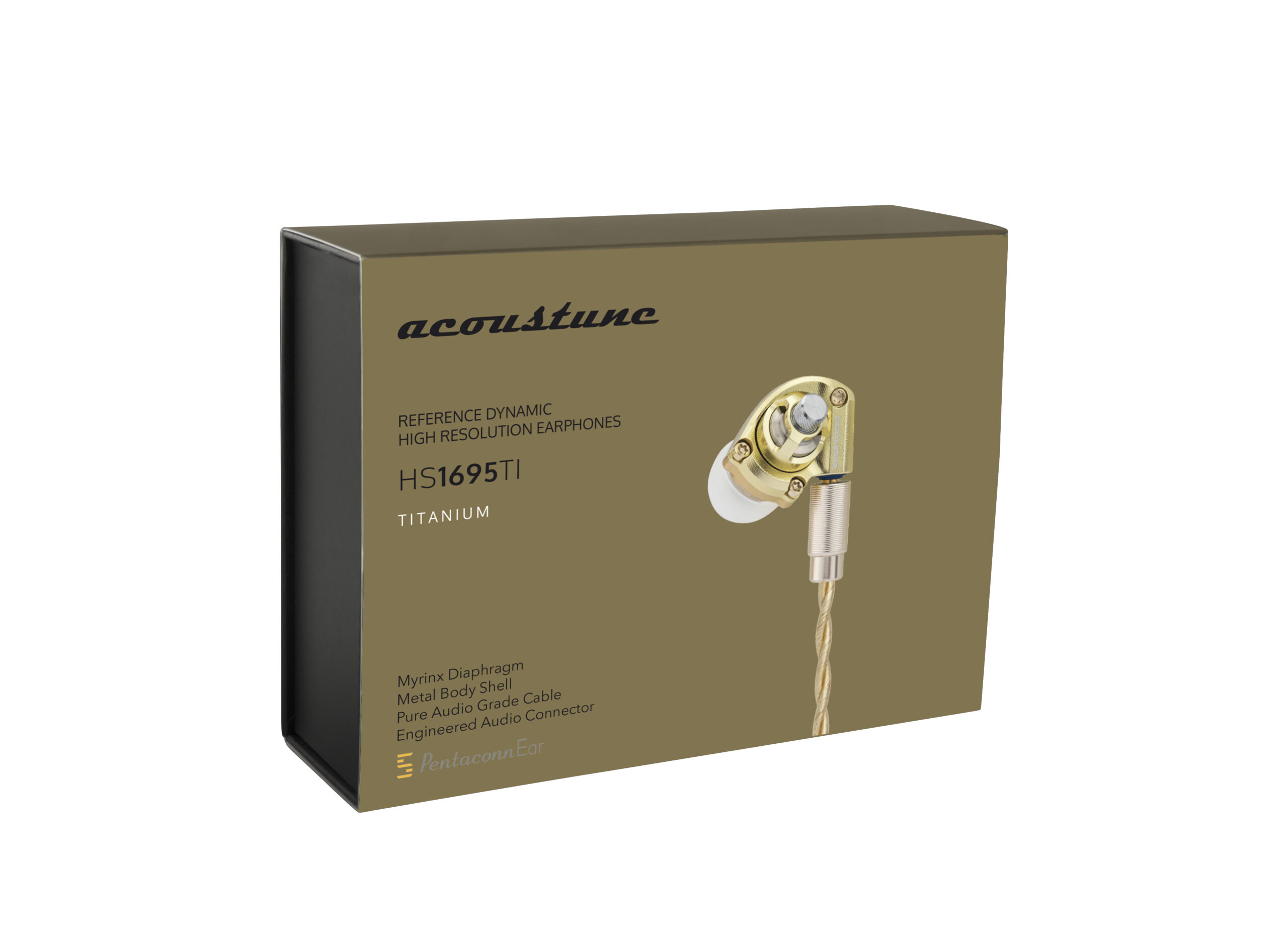
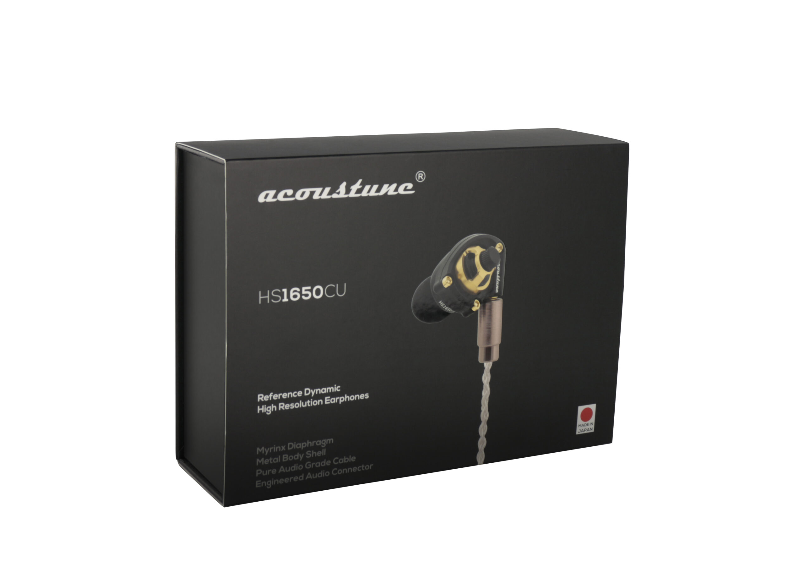
Para la marca japonesa de auriculares high end Acoustune, desarrollamos una estrategia global de marketing para el mercado europeo pero manteniendo la esencia nipona. Se pasó de colores genéricos azul y rojo a unos nuevos colores que tuvieran más sinergia con los materiales en los que están construidos. El objetivo era transmitir la calidad y percepción real del producto en el usuario final.
El concepto de exclusividad e ingeniería única de unos auriculares que parecen joyas. Se optó por elaborar la colección con los colores según su material principal de composición: negro, cobre, titanio y blanco. A juego se rediseñó el packaging para cada uno de ellos.
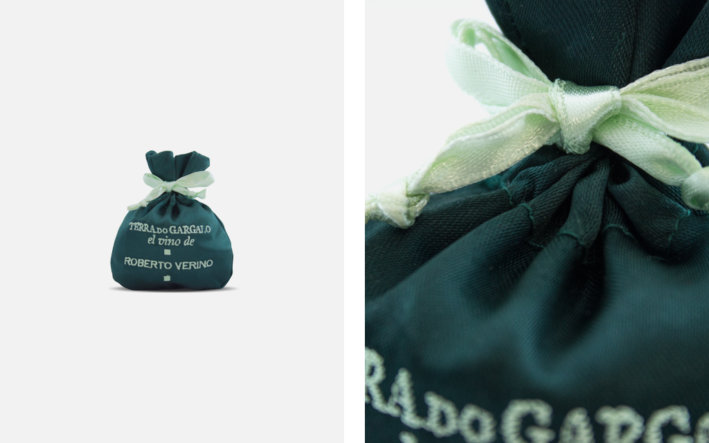
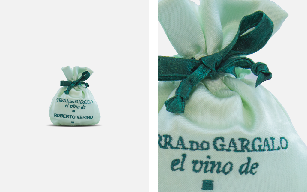
Our next project was assigned to us by the winery Terra do Gargalo. They explained their idea to us and trusted us to carry it out. The goal was to design a small pouch that had to hold a Robert Verino present. We used satin due to its softness and elegance, and embroidered the names with thread. We wanted to transmit delicacy. The pouch closed by shirring a satin ribbon that matched the embroidery. We designed and manufactured two different types of contrasts bearing in mind the corporate colors.
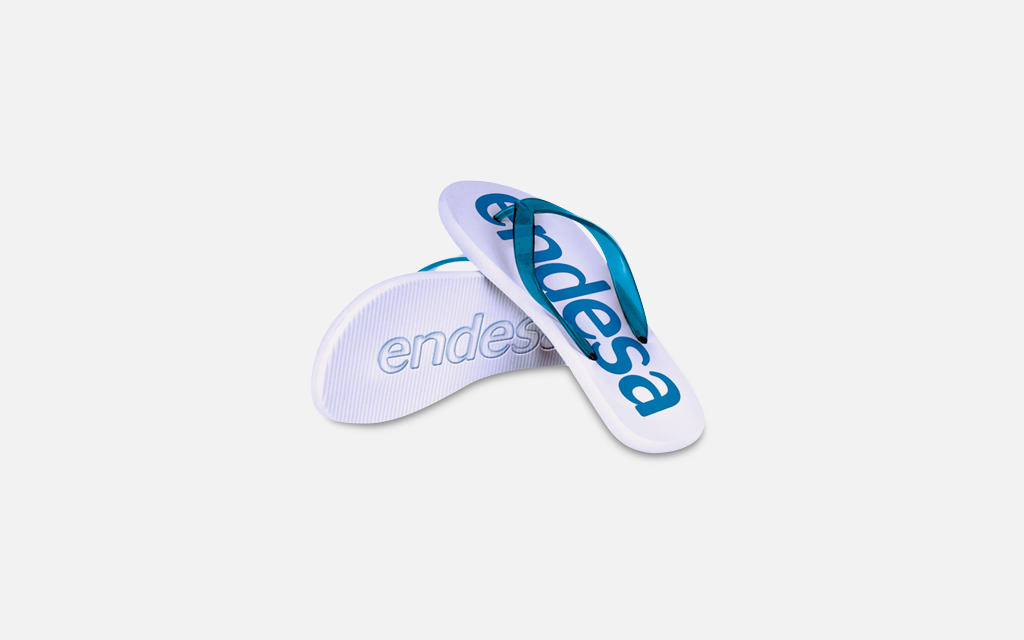
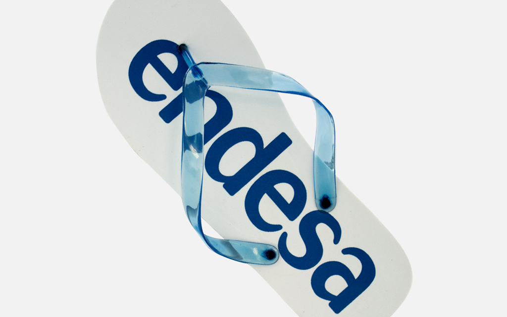
Endesa wanted to elaborate a mechandising product. The only requirement was that it had to be thought for the summer season. We proposed to them various options and they went for the flip-flops where the corporate colors, blue and white, stood out. What was interesting about them is that they had die-cut soles so their name was printed in relief over the sand as a symbol of energy.
We have already collaborated with Mallorca on several occasions.
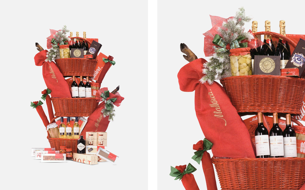
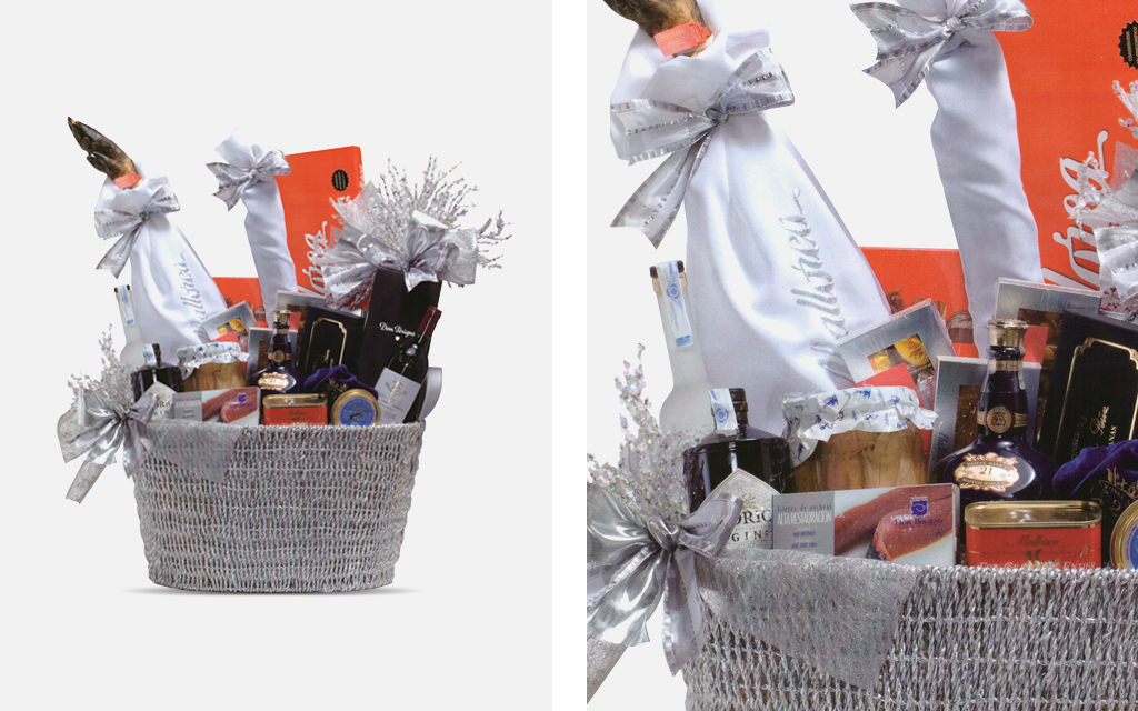
Once they assigned us the design and manufacture of some sheaths to present their Iberian products in their Christmas baskets: hams and loins. Designed with a resistant fabric in two colors: some in red and embroidered in golden thread and others in white embroidered in silver thread. The interior of the sheaths was laminated to preserve the product’s quality and also to keep its appearance intact at all times.
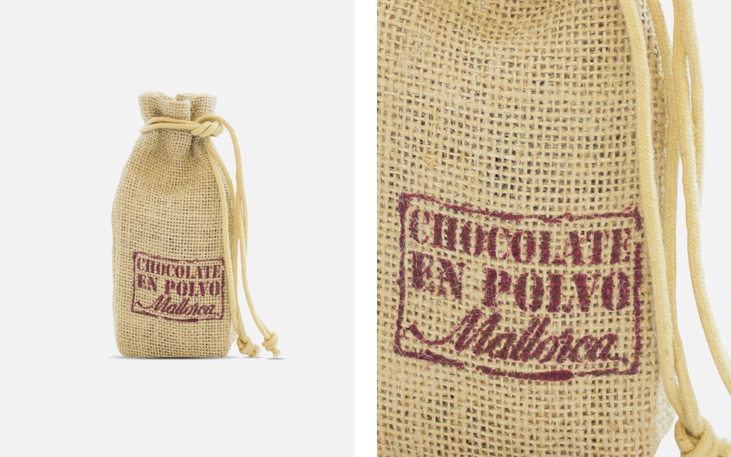
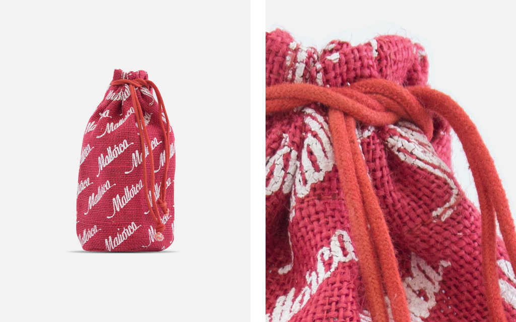
They also assigned us the design and manufacture of an item to present their chocolate powder, one of their most traditional products. We created a small jute pouch to express the idea of tradition. The printing of the name “Mallorca” and “Chocolate Powder” was made imitating an old stamp in a chocolate brown color. The pouch closed by shirring two strings.
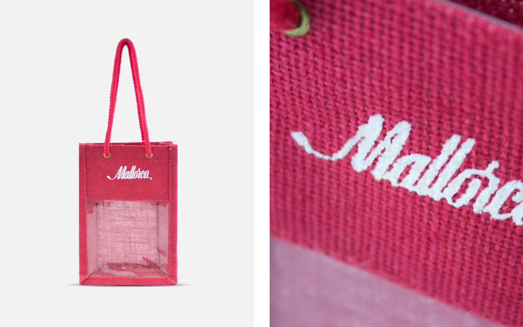
Mallorca thought of Cover once again to elaborate a new packaging element. This time, it was a small bag to present their assortment of products. We used the same material again: jute. This time, we made a small bag with handles and a PVC window so the products could be seen by customers. The bag was red and the printing was made in white ink.
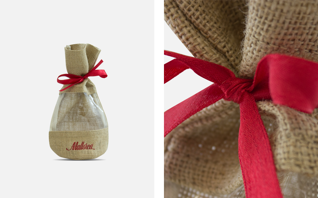
Another assignment we got from Mallorca was, again, a jute packaging element. It is a classic material that transmits simplicity, tradition and quality. We designed a small pouch with a closing satin ribbon and a PVC window to show the products it held. Both the ribbon to close the small pouch and the printed bakery’s name, were made in the corporate color: red.
.
After the success of the packaging elements we had previously made, Mallorca also chose us for the Christmas season. The project was creating a packaging for their collection of Christmas products. This time, we again designed a small, red jute pouch with the name “Mallorca” printed in white ink all around the pouch.
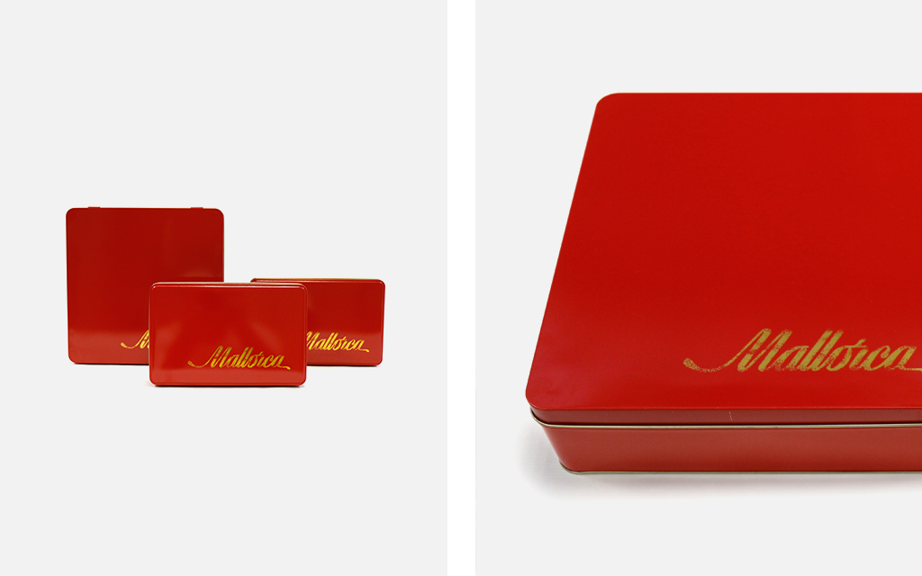
For the presentation of their chocolates, we carried out the design and manufacture of some metallic boxes. They had the corporate color but, this time, we decided to use a gold color for the logo. Gold is the color of luxury, a feeling of happiness. Those objects that cannot be made of gold, are gold plated and automatically become luxury items. This is the feeling we want to transmit. The interior of the boxes was also barnished in gold color.
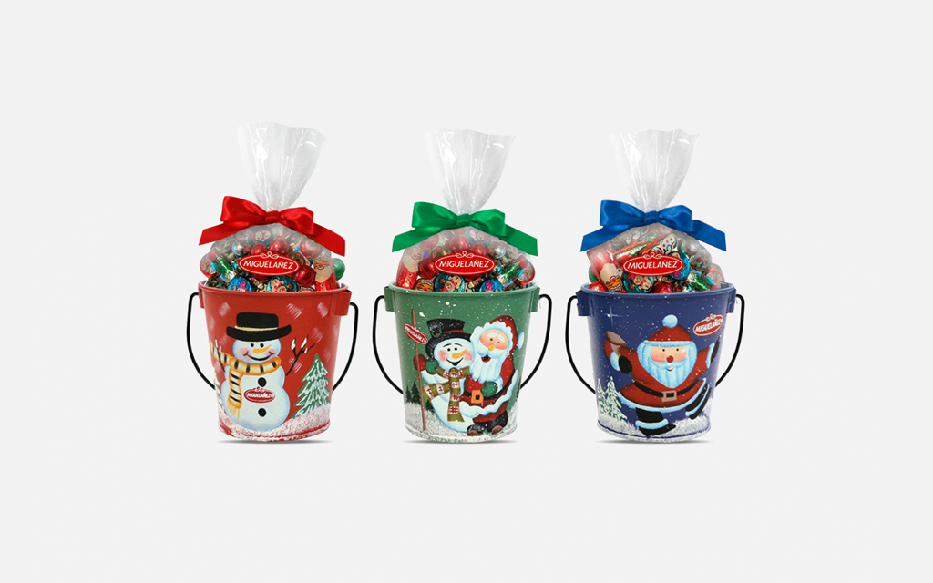
Miguelañez proposed to us a project for Christmas. Their idea was an item to present their products which had to combine the tradition of this holiday with the materials and the final appearance of the packaging. So we thought that making small tin cubes decorated with handpainted Christmas motifs would be perfect. The cubes had a handle and their size was perfect for children and as a decorative element.
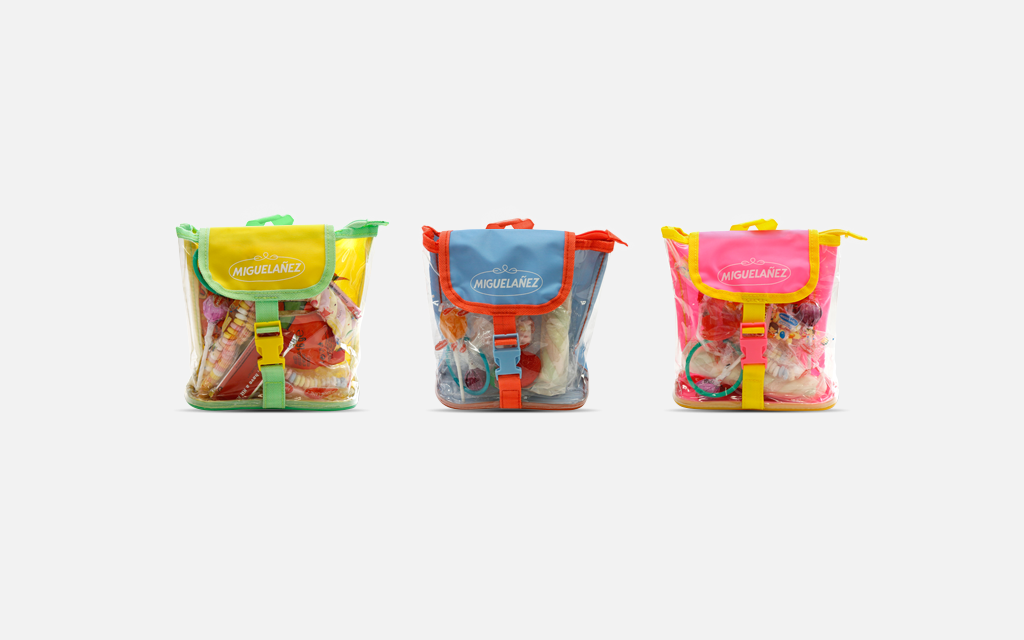
Miguelañez proposed to us the creation of a packaging item for a product assortment that could also be a promotional product. As school season was around the corner, we designed small colorful nylon backpacks and transparent PVC to see the products inside. The colors of the backpacks were made in attractive fluorecent tones.
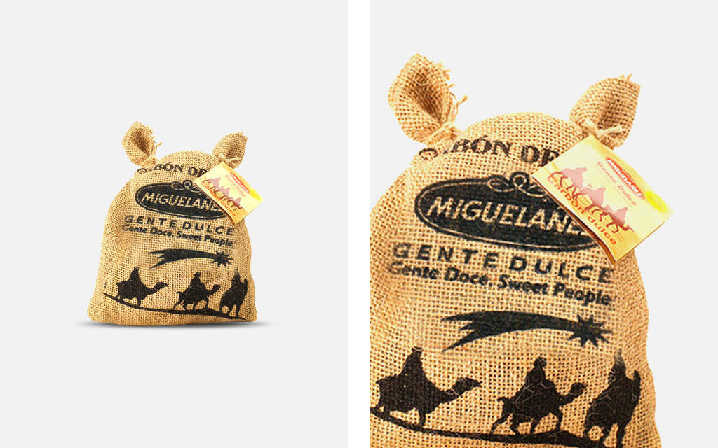
We were assigned another project for the Christmas season. This time it was for the classic and popular sweet coal. As this is a tradition for children, we proposed creating a small jute pouch as a coal-related packaging. The images of the brand and the Three Wise Men were printed in blank ink thus creating a feeling of nostalgia.
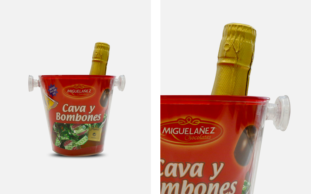
Another project Miguelañez assigned us, was creating a very special packaging. It had to be big enough to hold chocolates and a bottle of Freixenet sparkling wine white. Our idea was to create a small ice bucket of exactly that size. The main material for the body was transparent PVC and, for the cover, a red PVC. The latter had a small, round opening to let the bottle stick out.
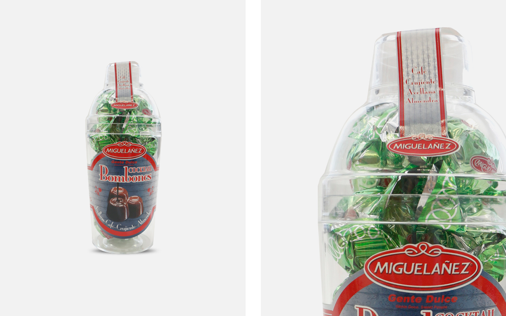
For the “cocktail” collection of Miguelañez chocolates, nothing better than designing and manufacturing a cocktail shaker as a packaging element that could also be a lifelike representation of those used by professional bartenders. The shaker was made in PVC and it contained its three elements: container, top part with inner strainer and its cover.
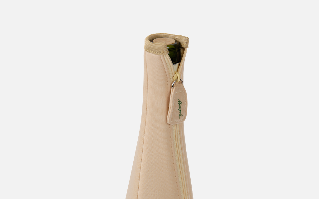
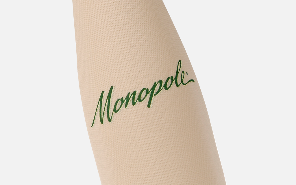
Monopole proposed to us a project for their white wine bottles. They wanted a simple yet useful sheath. In order to do this, we designed a quite original sheath. The main material was neoprene which helps wine keep its proper temperature. It was a sheath that perfectly adjusted to the bottle so it kept its shape. In addition, it had a zipper to open it and close it easily. The logo was printed at the front as well as on the zipper slider.
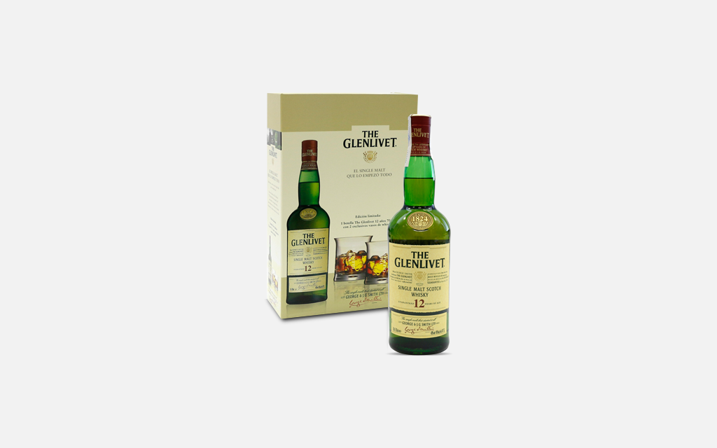
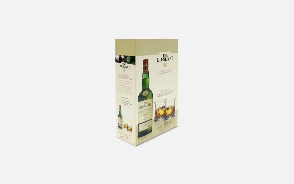
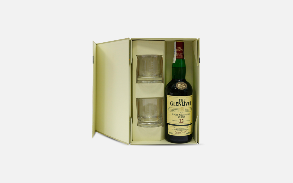
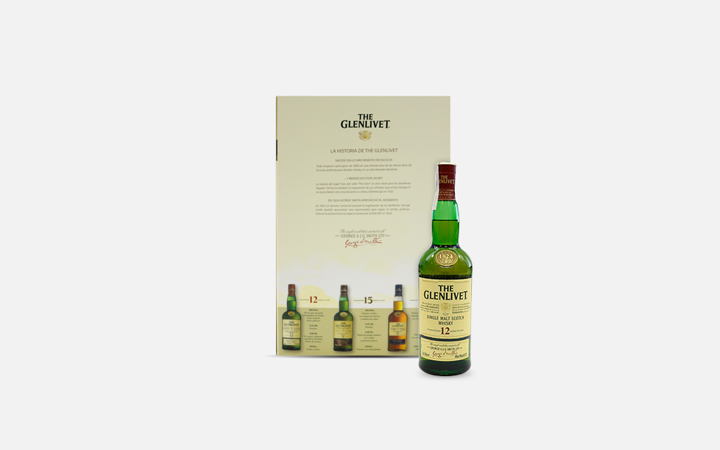
The Glenlivet had a project to treat their customers. They thought of us to carry it out. Here at Cover we transformed this idea. We manufactured a case with sufficient capacity to hold a bottle and two merchandising items. In order to obtain an optimal perception of the packaging’s quality, different printing techniques were combined to present the images, the text and the brand’s visual identity. The case was made of heavyweight, high resistant cardboard that had some magnets inside operating as a closing device. The case folded in order not to take much space. Inside, two whisky glasses exclusively made for the brand could be found.